Consider Hover UX for Tablet Device
Recently I bought Surface Go for browser testing and use it for my daily life too.
Sometime I met some sites which had hover based navigation but it didn’t work correctly on tablet device.
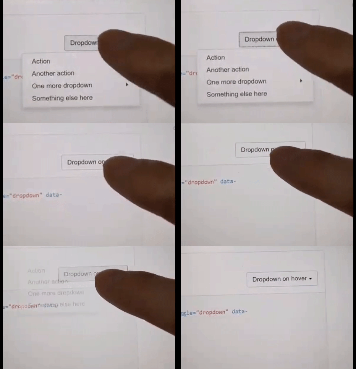
This is a capture when I used bootstrap-dropdown-hover which is bootstrap hover based navigation on Surface go.
It is difficult to tell what’s going on… I was trying to open dropdown menu but It didn’t work correctly.

What’s the matter?
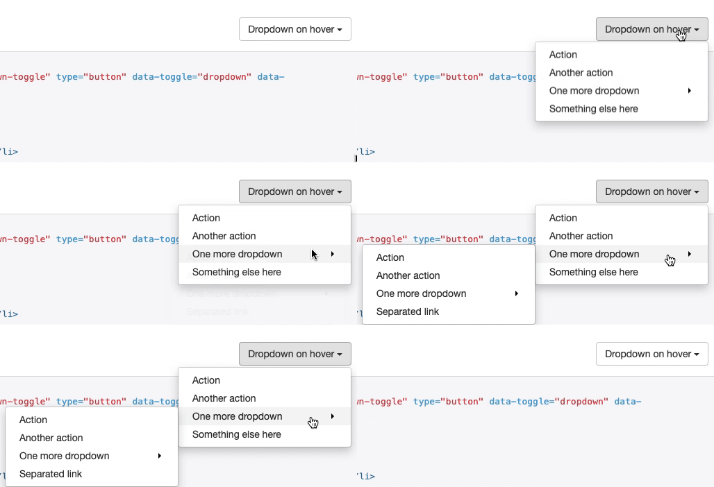
When I use laptop the dropdown menu works!!!

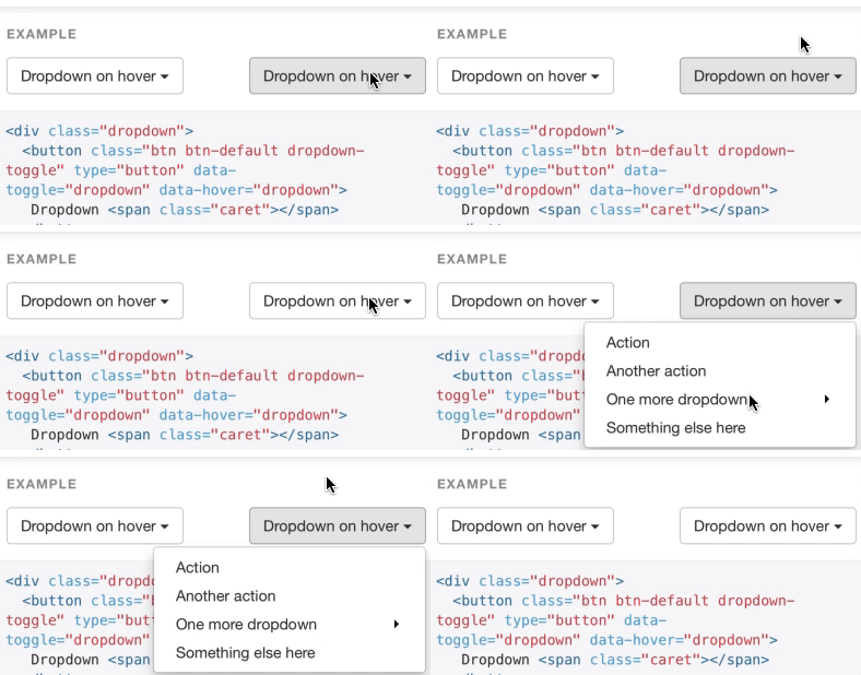
When I use mobile the dropdown menu works correctly too.
This is because most of mobile browser treat tapping and after tapping state as :hover CSS pseudo-class so if the hover based dropdown menu is implemented using :hover it’s works!!!!!

I wrote blog about this in my past blog post plz check more details.
How to set :active style to button in mobile
But it doesn’t seems that Edge browser on Surface go treats tapping and after tapping state as :hover.
| browser | hover | taping | after tapping |
|---|---|---|---|
| Edge on surface go | - | :active | :focus |
| mobile Safari | - | :active | :hover |
What should we do?
whether the browser treat tapping and after tapping state as :hover CSS pseudo-class or not is different in browsers so we need to detect that users use input device that works :hover or not.
Common mistake
/* for mobile style */
/* .... */
@media (min-width: 768px) {
  /* for tablet style */
  /* .... */
}
@media (min-width: 1024px) {
  /* for laptop style */
  /* .... */
}
The common mistake is separating style based on device width using min-width or max-width media query then you avoid to use :hover CSS pseudo based UI on tablet device.
In this way you don’t consider…
- Device has tablet width and works
:hover - Device has laptop width but doesn’t work
:hover
For example MS Edge on Surface Go has same width as table but doesn’t work :hover CSS pseudo…
How do we detect the devices?
We can detect devices which work :hover and devices which don't work :hover by using Interaction Media Features specs below.
- Pointing Device Quality
- Hover Capability
- Rare Interaction Capabilities
Prior knowledge
Devices can connect multiple input device such as mouse or tablet pen with touch screen device.
Pointing Device Quality
This is a kind of media query to detect accuracy of the user’s primary pointing device.
/* if user's primary input device includes a pointing device of limited accuracy */
@media (pointer: coarse) {
}

/* if user's primary input device includes a accurate pointing device */
@media (pointer: fine) {
}

/* no pointing device */
@media (pointer: none) {
}
Hover Capability
This is a kind of media query to detect hoverable of the user’s primary pointing device.
/* if user's primary input device includes a hoverable device */
@media (hover: hover) {
}

/* if user's primary input device doesn't includes a hoverable device */
@media (hover: none) {
}
Rare Interaction Capabilities
Pointing Device Quality and Hover Capability detect the capability of primary input device only so if user connect multiple input devices (like secondary input) those will be ignored.
On the other hand, You can detect those capabilities by using any-pointer and any-hover media queries.
Those detection are based on multiple input devices.
/* if user's primary input device includes "any" pointing device of limited accuracy */
@media (any-pointer: coarse) {
}

/* if user's primary input device includes "any" accurate pointing device */
@media (any-pointer: fine) {
}

/* no pointing device */
@media (any-pointer: none) {
}
/* if user's primary input device includes "any" hoverable device */
@media (any-hover: hover) {
}

/* if user's primary input device doesn't includes "any" hoverable device */
@media (any-hover: none) {
}
Rare Interaction Capabilities could match multiple queries because it is based on multiple input devices.
For example, The query result of Surface go with tablet pen is below.
@media (poiner: fine): because of tablet pen@media (hover: hover): because of tablet pen@media (any-pointer: fine)and@media (any-pointer: coarse): because of tablet pen(fine) and touch screen (coarse)@media (any-hover: hover)because of tablet pen
note: surface tablet pen can hover on elements
Plz check more detail and full of result of those queries below!!!!
Interaction Media Features and their potential
How can we use it?
@media (pointer: coarse)It might be better to make buttons bigger to tap easier@media (hover: none)It might be better to make other UI instead of hover one
But those queries don’t consider multiple input device so it could be better to use any-pointer and any-hover.
If you want your UI to adapt user’s input device…
@media (any-pointer: coarse)It might be better to make other UI instead of hover one
How to query in JavaScript
You can use matchMedia too in JavaScript.
window.matchMedia("(any-hover: coarse)").matches
// true or false
Notes
@media (hover: on-demand) and @media (any-hover: on-demand) are old specs so those are deprecated.
Remove “on-demand” value for hover/any-hover media queries. (removed)